A history of the X-Men logo over the years.
 |
| The X-Men #1 (July 2, 1963) |
 |
The X-Men #4 (January 3, 1964)
The fourth issue introduces a tiny flying Angel above the logo that lasts until issue 13.
|
 |
The X-Men #15 (October 5, 1965)
The fifteenth issue reintroduces the tiny flying Angel, but slightly higher than before. This lasts until issue 22.
|
|
 |
The X-Men #24 (June 30, 1966)
The 24th issue introduces a tiny Professor X above the logo. This lasts until issue 38. |
 |
The X-Men #42 (January 9, 1968)
The beginning of a stretch where the X-Men logo is smaller and placed above cover copy as "The X-Men featuring." This lasts until issue 48.
|
 |
X-Men #50 (September 10, 1968)
The first issue to use the new, more iconic logo created by new artist Jim Steranko. |
 |
X-Men #56 (March 12, 1969)
The first instance of a character on the cover grabbing or interacting with the logo. |
 |
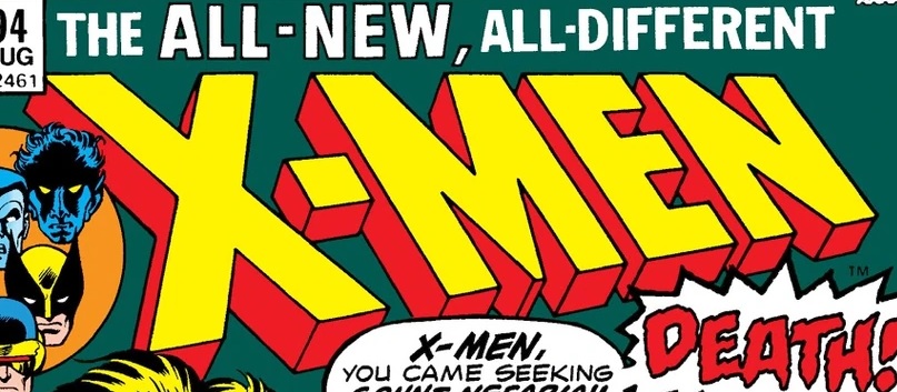
X-Men #94 (June 10, 1975)
The first issue post-Giant Size X-Men #1, with the logo now sporting "The All-New, All-Different" above it. |
 |
X-Men #112 (May 16, 1978)
"The All-New, All-Different" has now been swapped for "Now on Sale Monthly!" since the book has shifted from a bi-monthly to monthly schedule. |
 |
X-Men #114 (July 18, 1978)
The first issue to have the title "The Uncanny X-Men," although the indicia will still list it without "The Uncanny" until issue 142.
|
 |
X-Men #130 (November 20, 1979)
The introduction of Dazzler has the logo studded with disco balls (or just yellow balls, I can't really tell). |
 |
X-Men #135 (April 15, 1980)
The Dark Phoenix isn't just gripping the logo like the Living Month, she's destroying it! |
 |
X-Men #136 (May 20, 1980)
The logo now has visible cracks in it because of the Dark Phoenix. |
 |
X-Men #141 (October 21, 1980)
The first issue of "Days of Future Past" changes the logo to be more weathered and old. |
 |
Uncanny X-Men #176 (September 6, 1983)
The logo is now being destroyed by Cyclop's eye beams. |
 |
Uncanny X-Men #181 (February 7, 1984)
The current team of X-Men hang out on the logo. |
 |
Uncanny X-Men #184 (May 8, 1984)
The logo is now burning. |
 |
Uncanny X-Men #198 (July 9, 1985)
The first instance of the logo being transparent. |
 |
Uncanny X-Men #251 (July 4, 1989)
The next time the logo turns transparent. |
 |
Uncanny X-Men #252 (July 18, 1989)
The logo being burned by the Reavers. |
 |
Uncanny X-Men #270 (September 4, 1990)
The logo being broken apart by Havok's blast. |
 |
Uncanny X-Men #271 (October 2, 1990)
The logo is still not fully together as it's pulled apart by Cameron Hodge. |
 |
Uncanny X-Men #276 (March 5, 1991)
The logo is bigger, more stretched out than normal. |
 |
Uncanny X-Men #294 (September 1, 1992)
"The Uncanny" is now situated on box to the left of the logo, rather than above. This will last until issue 296, but occasionally return during other crossovers. |
 |
Uncanny X-Men #319 (October 4, 1994)
A radically different logo that appears for only one issue before reverting back. |
 |
Uncanny X-Men #337 (August 7, 1996)
The logo is rippling as if underwater now. |
 |
Uncanny X-Men #353 (January 2, 1998)
The logo changes radically again, looking as it did in #319, before reverting back again. |
 |
Uncanny X-Men #377 (December 1, 1999)
Apocalypse using Cyclops to shatter the logo. |
 |
Uncanny X-Men #384 (July 6, 2000)
The next radical shift in the logo. Unlike the past two attempts, this one sticks around...for three issues before it goes back to being the classic logo. |
 |
Uncanny X-Men #393 (April 18, 2001)
The logo now appears made of rock, craggy and cracked. |
 |
Uncanny X-Men #394 (May 2, 2001)
The next big shift for the logo. This one does manage to last a while, up to issue #443. |
 |
Uncanny X-Men #401 (December 19, 2001)
For the "'Nuff Said" issue, Banshee blows away the logo with his scream. |
 |
Uncanny X-Men #444 (May 5, 2004)
This logo actually looks like a combination between the classic logo and the one used from #394-443. It's tilted and three-dimensional like the classic, but the X remains asymmetrical as before. |
 |
Uncanny X-Men #465 (October 5, 2005)
The logo in neon lights. |
 |
Uncanny X-Men #466 (November 23, 2005)
A cover by Chris Bachalo where the logo is carged into rock. |
 |
Uncanny X-Men #472 (April 12, 2006)
A very steampunk-ish variation of the logo. |
 |
Uncanny X-Men #474 (June 21, 2006)
Cannonball destroying the logo in neon lights. For some reason. |
 |
Uncanny X-Men #475 (July 5, 2006)
For the first issue of Ed Brubaker's run, the logo shifts again, this time closer to the classic version, but without the three-dimensionality, replacing the blocky letters with shadowed letters. |
 |
Uncanny X-Men #492 (November 7, 2007)
During the "Messiah CompleX" crossover, every series had their logo in this plain font. |
 |
Uncanny X-Men #495 (February 6, 2008)
The bottom part of the logo is sheered off. |
 |
Uncanny X-Men #497 (April 23, 2008)
The logo becomes a trippy, swirly logo, as the plot of the issue involves Lady Mastermind making people in San Francisco believe they are in the Summer of Love. |
 |
Uncanny X-Men #512 (June 24, 2009)
Another time displaced logo, as the characters go back to 1906. |
 |
Uncanny X-Men #513 (July 1, 2009)
Almost every book in the "Utopia" crossover will have their logo in this font. |
 |
Uncanny X-Men #523 (April 7, 2010)
Every book in the "Second Coming" crossover will have their logo in this font. |
 |
Uncanny X-Men #540 (July 6, 2011)
Every book in the "Fear Itself" crossover will have their logo in this font. |
 |
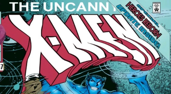
Uncanny X-Men (vol 2) #1 (November 2, 2011)
When Uncanny X-Men is relaunched after issue #544, it gets a brand new logo. The assymetrical X is still there, but it's a different font, no tilting, and no shadow. |
 |
Uncanny X-Men (vol 2) #5 (January 18, 2012)
The logo regains its shadow. It will have it on and off throughout the run.
|
 |
Uncanny X-Men (vol 2) #10 (April 11, 2012)
The character of Unit destroys the logo.
|
 |
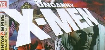
Uncanny X-Men (vol 3) #1 (February 13, 2013)
After Brian Michael Bendis takes over and the book is relaunched again, the logo is radically redesigned. This logo will last for the entirety of Bendis's run and even be used on Uncanny X-Men #600. |
 |
Uncanny X-Men (vol 3) #3 (March 13, 2013)
Magneto destroys a version of the logo. |
 |
Uncanny X-Men (vol 3) #17 (February 19, 2014)
The logo carved into the ground (even the copyright symbol). |
 |
Uncanny X-Men (vol 3) #23 (July 16, 2014)
Every book in the "Original Sin" crossover will have their logo in this font. |
 |
Uncanny X-Men (vol 3) #29 (December 24, 2014)
The logo in stone is being gnawed by, I believe, Krakoa. |
 |
Uncanny X-Men (vol 4) #1 (January 6, 2016)
In the post-Secret Wars relaunch, the logo is again redesigned, this time as the Brubaker/Fraction era logo being split and having "Uncanny" in the middle. This logo will last for the rest of this run. |
 |
Uncanny X-Men (vol 5) #1 (November 14, 2018)
After a period of time without an Uncanny X-Men (for ResurrXion, the books were X-Men: Blue and X-Men: Gold), in 2018, Uncanny X-Men is relaunched again, this time with the logo reverting back to its classic appearance from the Claremont era. |
 |
Uncanny X-Men (vol 5) #6 (December 19, 2018)
For four issues, the comic has a banner tribute to the recently deceased Stan Lee at the top of the cover and the logo in this font at the bottom. |
 |
Uncanny X-Men (vol 5) #22 (July 17, 2019)
The last time we have seen the Uncanny X-Men logo until now. |
 |
The logo used in the announcement of the "X-Men: From the Ashes" relaunch.
|


Comments
Post a Comment